Don’t play with radon!

Our house, built into a slope and on a rock seam, also lies within a medium-high radon risk area, according to PHE/UKradon. A while back, I applied to UKradon for a home testing kit, which comprised three dosimeters: one for each floor. When the results came back in from the laboratory, some of my fears were confirmed. Ideally, levels should be below 100 (Bq/m³), but not exceed 200.

Our results were as follows:

  • Bedroom (top floor): 37
  • Living Room (ground floor): 85
  • Kitchen/diner: 290!

I suspected the source to be ground radon. The kitchen/diner and extension is built on a new slab with a gas-proof barrier (see earlier post). But, the undercroft beneath the original house simply has a concrete slurry cap (nominal 4in thick) poured on top of the subsoil – I believe the radon is permeating through this cap. The section below has been highlighted to show the suspected radon source (red):

Continue reading

Indoor Air Quality: VOCs

This first article on the topic of IAQ reports on the results from enhanced monitoring and air sampling, which took place during the winter (2015/16) to evaluate the levels of volatile organic compound (VOCs) pollutants inside the home, and the potential increase of these pollutants when the ventilation rate was reduced.

The chart shows the results of samples taken from the main bedroom and living room over two 7-day periods. The first set of samples were taken with the MVHR ventilation running continuously (i.e. as normal) delivering 220 m³/hour (approximately 0.5 air changes). The second set of samples were taken with the ventilation set to unoccupied mode, which delivers 140 m³/hour for 15 minutes in every hour (less than 0.1 air changes) – show as ‘ventilation off’ on the chart. Activities and occupancy were similar, and there was a two-week interval between the samples being taken.

According to the performance criteria in Approved Document F, exposure to TVOCs should not exceed 300 μg/m³ averaged over an 8-hour period. It is clearly evident that, whilst the ventilation is running normally, both the living room and main bedroom fall well within this threshold value, measuring 80 and 90 μg/m³ respectively, averaged over the 7-days. However, the repeat measurement with the reduced ventilation rate shows and increase to 340 and 370 μg/m³ receptively for these rooms – an increase of around 75%. The ventilation rate was reduced at the beginning of the sampling, so the observed concentration would likely be higher still if the sampling commenced at a later point.

Whilst TVOCs do not give an indication of the ‘toxicity’ of the air, analysis of the chromatograms identified chemicals, which included: 2-chloropropane – a chemical used as a blowing agent in some phenolic insulants; α-pinene and 3-carene – naturally occurring, derived from oils in woods, but still can cause skin irritation at higher concentrations; texanol – a solvent used in paints. In the lower ventilation (2nd) sample the same chemicals were observed, but at higher concentrations.

This experiment demonstrates the importance in the use of purpose-provided ventilation. Without ventilation, and within an airtight property, the concentration levels of pollutants inside seem set to rise – who knows how high these concentrations would have risen to if the experiment continued for longer than 7 days.

More IAQ stuff to come.

featured in passivehouse+ magazine

WP_20160210_001

We are pleased to be featured in this month’s passivehouse+ magazine. The article has given me a bit of a jab in the arm to do further updates on this blog. So upcoming themes will include:

  • Indoor Air Quality – we have recently monitored the home (winter 2015/16) for a range of pollutants: VOCs; formaldehyde, nitrogen dioxide and radon.
  • Water use – have we managed to reduce our water use as well as our energy use?
  • Energy use – comparison of the last three heating seasons, and further interventions made to further optimise our gas and electricity use

Check back soon for these updates.

electrical use profile – ground floor power

I have progressively looked at how we use power on the ground floor. This circuit, along with all others in the house, is sub-metered. A review of the data from all sub-circuit meters showed that the ground floor and lower ground floor, combined, were responsible for some 50% of total electrical energy use (see previous post).

The chart below shows the proportional distribution of power on the ground floor as it currently stands. This data is taken from additional plug-in meters on some key-use sockets, which have been installed since November 2014. As we run two small businesses from home, much of the power is related to IT on this floor. The ‘study’ and ‘studio’ represent the two business areas, which together are responsible for around 40% of the use on this circuit. IT servers and comms equipment are powered from a central point, and this adds a further 23%. Broadly speaking, we could say that 2/3rds of the power use on the ground floor is related to IT equipment – 85% use of which is business-related; 15% for recreational (browsing, etc).

GF Socket profileWhat still jumps out at me is the amount (currently 23%) for TV equipment, namely a small 22in Philips TV and a Virgin V+ box. This is the only TV equipment in the house: we don’t watch that much. So why are these two bits of equipment responsible for so much use. The plug-in meters have only been in since November 2014, and we had made some interventions before this point, so the proportion (pre-November) would have been significantly higher than 23%. The chart below shows the daily average profiles for three key months over the last year and illustrate the interventions made.

GF Socket daily profile

Bands 1 to 7: 1, 2 and 7 are overnight, 3 and 5 are working hours, 4 is lunch break, and 6 is evening.

The green line represents July 2014. This is the baseline: using IT and TV equipment without any specific intervention to reduce energy. In August I plugged in a time switch to switch the Virgin V+ box off between 0200hrs and 1600hrs (we never watch or have anything set to record during these times). The benefit of doing so is shown in the September 2014 profile (blue) in band 2. Also in August, several local drives were replaced with two main server drives – the difference in power use in bands 3 and 5 shows that the new equipment is less power hungry (≅80 kWh/yr saving).

In January 2015, the Philips TV was added to the timer circuit, and the timer adjusted slightly (0200 to 1700 hrs). This is shown by the purple line for February 2015. Now the TV and Virgin V+ box both switch off for 15 hours in every 24, and this translates to 140 kWh/yr for the V+ box and a further 100 kWh for the TV: a total of 240 kWh/yr, around £35. The £5 timer has paid for itself in less than two months! Why does the TV equipment use so much in standby? Hopefully, the new EU Ecodesign Directive will have sorted this out for future replacement equipment.

The chart shows our current baseload (band 2) as 34 Wh (2.8 Wh/5mins), or 0.8 kWh/day (300 kWh/yr). This is due to the broadband router (which can’t be time clock controlled) and server equipment in standby/eco mode. At £45/year, we may need to accept that this is as good as it gets. May be Virgin will bring out more energy efficient equipment in the future (V+ box and broadband superhub): if not we may need to consider alternatives.

Overall, whether due to specific interventions, or down to incidental benefit of replacing equipment, the energy savings from this one circuit is forecast to be around 320 kWh/year, approximately £48 – a 10% reduction on our total electricity use.

electrical energy use

The sub-meters that were installed (see earlier post) have been sending data every 5 minutes to the data logger for the last 18 months. Regular analysis of this energy data has allowed us to start optimising our energy use. The chart below shows the recorded energy use for each electrical circuit (click for enlargement).

Annual Electrical Profiles

The green coloured stacks show the lower ground floor socket circuit, and purple is for the ground floor sockets. These two circuits were responsible for over half our annual electrical use (2014). Given that we operate two separate businesses from home, the ground floor circuit (mostly IT and electronics) did not ring too many alarm bells at first. However, there is room for some efficiency here – additional plug-in meters for individual equipment have been fitted, and results from this investigation will be posted shortly. A closer look at the lower ground floor showed that a fridge freezer (which we inherited with the house) was responsible for nearly 60% of the consumption of that circuit (15% of total electricity). We made a decision in October 2014 to retire the old fridge and replaced it with a new efficient A+ model. Whilst it has made a significant improvement, in hindsight, we should have gone for an A+++ model. Although an extra £150 to buy, the payback from additional energy saved would have been a similar 7-8 years as with the A+ model. But then A+++ model availability is fairly limited right now, and A++ unit payback (similar purchase price to A+++ but greater model choices) wasn’t worth it in payback terms (9-10 years).

The blue colour on the chart shows the lighting energy use, which varies as expected across the seasons. However, November 2013 to February 2014 showed a higher than expected energy use for lighting, so some changes were made:  changing over a couple of regular-use lamps to LEDs, and being more economical with use. The reduction in energy use 12 months on (November 2014 to February 2015) is fairly evident – approximately half the amount of energy used. Except for the MVHR circuit, the remaining circuits are limited in their ability to be further optimised. The MVHR unit used a total of 290 kWh in 2014, which is within expectations. It has just been re-commissioned, which resulted in some fan speed adjustments to slightly lower settings, but this summer we may also look to switch it off for some periods when windows are open.

The dotted blue line shows the total electrical energy use trend over this period. We are on a downward trajectory, which is good. Our total electricity for 2014 was 3240 kWh – a 21% reduction compared to pre-retrofit use of 4120 kWh (nearer to the UK average household for 2013 of 4170 kWh¹). The aim is to get the annual consumption comfortably below 3000 kWh – a  further 10-20%, which looks to be achievable.

¹ Energy Consumption in the UK (2014) – Department of Energy & Climate Change

a good morning for more thermal imaging

Front 2 Jan 2015

Perfect conditions this morning for some more thermal images. The house is still performing well, and as these images show, there is quite a contrasting heat loss between us and neighbouring properties (which have cavity wall insulation). The temperatures across the front elevation show good uniformity, and the triple-glazed windows are approximately the same temperature at centre pane point (spot temperatures on image below: Sp1 = minus 6.5°C and Sp2 = minus 6.2°C). As highlighted in the the posting for last year’s survey, there is some thermal bridging around the top of the windows, but budget restrictions meant that we didn’t invest in the best thermal performers. Still quite pleased with with their overall performance.

Front 1 Jan 2015

It’s not all good news however. Around the back, some problems are coming to light (in the IR spectrum). This is where the first lot of external wall insulation was applied, and it looks like we have some thermal bypass – possibly air gaps beneath the first insulation layer.

Temperatures on the spots below are: Sp1 = minus 5.0°C, Sp2 = minus 2.1°C, Sp3 – minus 2.8°CRear Flank Wall

Temperatures on the spots below are: Sp1 = minus 5.0°C, Sp2 = minus 3.4°C, Sp3 – minus 2.0°C, Sp4 = minus 2.7°C, Sp5 = minus 5.0°CRear Flank Wall Low

There’s not a lot we can do about this, unless a problem arises in the future. The internal scan showed good uniformity, and checks with a moisture meter do not suggest anything sinister. Not sure why this didn’t show up on last years survey – perhaps some de-lamination has occurred over the last year? It was the wettest point, I recall, so may be the adhesive has de-bonded – this is why mechanical fixings are also required. I will, at some point, do in-situ U-value measurements. If I apply heat flux plates around here then I can compare with a ‘good’ section and see what the difference is. When I know more, I’ll post. As always, I welcome comments.

we are now a SuperHome

front completed

After demonstrating that our retrofit has achieved 69% carbon emission reduction, compared to its pre-retrofit state, we are very pleased to announce that our home has been accepted onto the SuperHomes network. The 69% reduction, which is based upon calculation, compares very well with our measured reduction of 71%, both in carbon emission terms (kgCO2/m²/yr) and primary energy (kWh/m²/yr). This reduction  has been achieved even though the treated floor area of the house has increased by more than 20%.

Read more on our listing page on the SuperHomes website. You may also be interested to read our entry on the Low Energy Buildings Platform, which gives more technical information.

post retrofit energy data: the first year

Total Energy Use_1

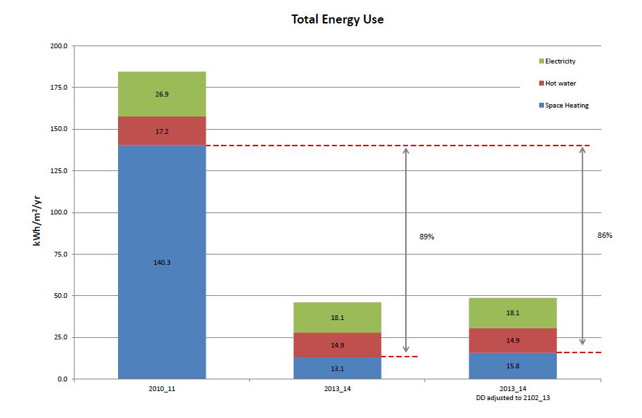
The chart shows a summary of our measured energy use over the last 12 months for gas and electricity, compared to energy the first (base) year that we were here, which spanned a cold winter (2010_11). Over this period we used a huge amount of gas: 24,367 kWh (typical consumption for an older home is 20,500 kWh/annum¹). The split between heating and hot water was estimated² as 89% and 11% of total gas use respectively, and equates to a specific heating consumption of 140.3 kWh/m²/yr. The comfort in the house was poor that winter and the old heating system really struggled to keep the house warm.

Now fast forward to the last winter 2013_14³, which was comparatively mild, but the reduction in space heating and total gas use is quite striking. Total gas use has reduced by almost 80% compared to the base year, and space heating has reduced by almost 90%. Total gas consumption was 5300 kWh for the year, with proportions being 47% for space heating, 47% for hot water and 6% for new gas hob. The specific heating energy for the last year was 13.1 kWh/m²/yr, which comes in a touch below the Passivhaus target of 15 kWh/m²/yr.

Weekly Degree days

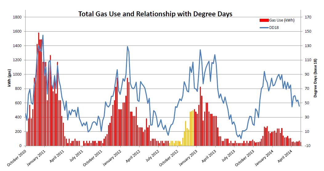
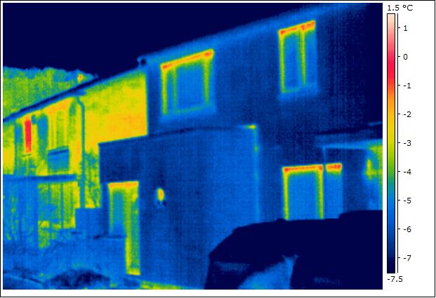
The chart above shows the weekly gas meter readings (total gas) with the degree days overlaid (blue line). Put simply, heating degree days give an estimate of the amount of heating energy, calculated using local, historic weather data. The chart shows a very close fit between the degree days and heating energy use for the first winter (left side of chart). Moving toward the right shows how the gas has progressively reduced (note yellow areas denote when gas was decommissioned during construction: meter reading substituted for electrical heater meter readings). Most striking is the comparison between the last winter of 2013_14 to the winter of 2010_11.

In acknowledgement that it was an unusually mild winter, I have carried out a degree day assessment to determine the amount of heating that would have been required in a cold winter (using the long, cold winter of 2012_13 for the assessment comparison). The results of the assessment for this region, estimate that 21% more heating energy would have been required. This would increase our specific heat demand by 2.7 kWh/m²/yr, to 15.8 kWh/m²/yr – refer back to the right-hand column on the top chart ‘2013_14 DD adjusted’. This revised value is a little above the maximum for a Passivhaus, but is much lower that the maximum allowed for a Passivhaus retrofit (EnerPHit), which is 25 kWh/m²/yr.

There is still a little more thermal work to do beneath the house (insulation and airtightness), so hopefully we will continue to make reductions. But we are very pleased with the results so far. Or, as one of our neighbour’s put it: ‘snug and smug’!

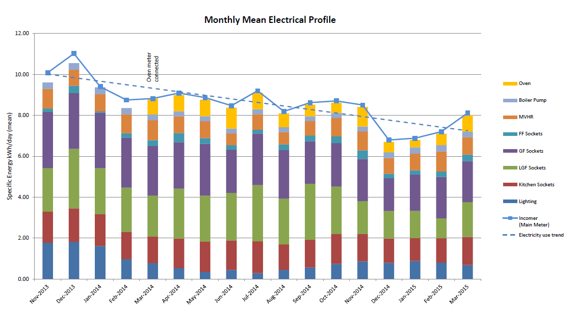
Electrical energy has reduced by 17% compared to the first year, although we still have some further efficiencies to make. All lighting is now either LED (approx 50%), or a mix of compact and linear fluorescent, which is the main measure so far. But, we added an MVHR ventilation system as part of the retrofit, so a 17% overall reduction is not too bad right now.

More details will become available shortly, particularly for electrical energy use, which is fully sub-metered. At some point I hope to be able to do some in-depth analysis on the gas use to measure, rather than estimate, the proportions for heating, hot water and cooking. But, with an annual gas bill of C.£200, it is difficult to justify spending the best part of £1000 to buy and fit the monitoring kit and pulsed meters to do this.

References:
1. Source OFGEM: Typical Domestic Energy Figures.
2. Estimate based upon average of weekly summer gas readings multiplied by total weeks/year.
3. Analysis for years 2012_13 has not been included in chart due to  construction activities.

monitoring data: winter comfort

I have taken a closer look at the monthly data for temperature, relative humidity and CO2 concentrations. The previous post considered mean monthly values, whereas the charts in this posting give the hourly averages during February 2014. In addition to the mean value, I have also charted the 10th and 90th percentile values to illustrate the ‘bandwidth’ for the observed conditions.

Feb T_RH_CO2

This chart shows the mean hourly conditions in the bedroom in February. The temperature (blue) has a mean of 18.2ºC, with a very small mean deviation of +/-0.6ºC between 10th and 90th percentile. This constant temperature means the comfort conditions are excellent – no more waking up feeling cold in the middle of the night.

Relative humidity is also near optimal with a mean of 52% (should ideally be between 40 and 60%). Again, there is a small mean deviation of +/-3%, indicating that the ventilation in the bedroom is sufficient for managing metabolic moisture levels. Note, that the ‘blip’ that occurs at around 0900hrs (and on temperature) is when the sun passes over the sensor.

The CO2 levels show that the bedroom is in use typically from 11pm through to 7am. The mean values for daytime are from 7am through to 7pm and show that the mean CO2 concentration is 737ppm. During the night (7pm to 7am) the mean is 995ppm. The 24hr mean is 865ppm and is within guideline values of 800-1000ppm (mean) and 1500ppm peak. The 90th percentile shows a peak of approximately 1500ppm at around 3am. This may be the cause for some debate amongst my contemporaries, but I don’t believe that a 1500ppm peak in a bedroom is a problem. Many bedrooms concentrations that I have seen elsewhere peak well above 2500ppm. At 5000ppm, CO2 concentrations are likely to lead to drowsiness, but the longer-term risk is that other, more toxic, pollutants will also increase. But, in reality, I am not too bothered if the 1500ppm peak CO2 makes me drowsier at 3am. I would add that, since the ventilation system has been commissioned (and fine tuned), the conditions in the bedroom in the morning are ‘fresh’. Before the renovation, and particularly in winter when the windows were closed, it was notably ‘stuffy’ and stale in the mornings. Not any more.

Feb T_RH_CO2 Lounge

Feb T_RH_CO2 Kitchen

The kitchen and living room charts are posted here too. They too show the performance is doing well. But, for brevity, I won’t go into too much detail with these charts – they tell their own story in a way. But briefly, the living room shows a slightly warmer temperature, compared to the bedroom and kitchen. This is due, in part, to the occasional use of the wood burner. The 90th percentile indicates the wood burner benefit from 8pm onward. CO2 levels in the kitchen show when we are preparing meals for breakfast, lunch and dinner, with concentration levels peaking at around 1400ppm.

Do drop me a line if you have queries. I plan to post more on comfort conditions through the year, so keep checking back.

first monitoring results: comfort

I have now analysed the comfort data for the winter. The monitoring started in November 2013, although some data was collected in October. The chart below shows the mean temperatures, relative humidity and carbon dioxide concentrations for the three rooms being monitored. I have only posted the charts for the first part of the winter here (I am analysing in quarters Nov-Jan; Feb-April; etc).T_RH_CO2 Nov2013_Jan14

The mean temperatures for November to January show a fairly even distribution across the house. The living room has a slightly warmer mean, probably due to the occasional use of the wood burner. Our thermostats for the heating are set at 18°C on each floor – this being our preferred temperature, not an attempt to be frugal.

Relative humidity (RH) was a bit of a problem, causing some localised mould growth for the first few months after completion. I have attributed this to the drying out of the wet construction and finishes (mortar, plaster, etc), and because the house was becoming increasingly airtight with late commissioning of the ventilation system (switch on mid-September 2013). The mean RH should be between 40 and 60%, and the monitoring shows a steady decrease from November through to January. It is slightly higher in the kitchen, due to cooking activities. The RH has continued to drop in February and March (check back later for an update). The initial problem with mould has now disappeared.

To maintain good indoor air quality, CO2 concentrations should average between 800 to 1000ppm. By keeping below or within this band, other (more serious) pollutants, such as VOCs, are kept within safe levels. The measured CO2 levels are higher in the bedroom, as this is where we spend more time than any other room (that is being monitored). I have carried out some fine tuning to the ventilation in February and the average has dropped to below 1000ppm. However, I feel that reporting monthly averages for CO2 concentrations is not particularly representative, and therefore useful. CO2 concentration levels are only of interest when rooms are occupied. So, I will provide further analysis on CO2 in future posts, but what this overview shows is that we have no real concerns about indoor air quality.