electrical use profile – ground floor power

I have progressively looked at how we use power on the ground floor. This circuit, along with all others in the house, is sub-metered. A review of the data from all sub-circuit meters showed that the ground floor and lower ground floor, combined, were responsible for some 50% of total electrical energy use (see previous post).

The chart below shows the proportional distribution of power on the ground floor as it currently stands. This data is taken from additional plug-in meters on some key-use sockets, which have been installed since November 2014. As we run two small businesses from home, much of the power is related to IT on this floor. The ‘study’ and ‘studio’ represent the two business areas, which together are responsible for around 40% of the use on this circuit. IT servers and comms equipment are powered from a central point, and this adds a further 23%. Broadly speaking, we could say that 2/3rds of the power use on the ground floor is related to IT equipment – 85% use of which is business-related; 15% for recreational (browsing, etc).

GF Socket profileWhat still jumps out at me is the amount (currently 23%) for TV equipment, namely a small 22in Philips TV and a Virgin V+ box. This is the only TV equipment in the house: we don’t watch that much. So why are these two bits of equipment responsible for so much use. The plug-in meters have only been in since November 2014, and we had made some interventions before this point, so the proportion (pre-November) would have been significantly higher than 23%. The chart below shows the daily average profiles for three key months over the last year and illustrate the interventions made.

GF Socket daily profile

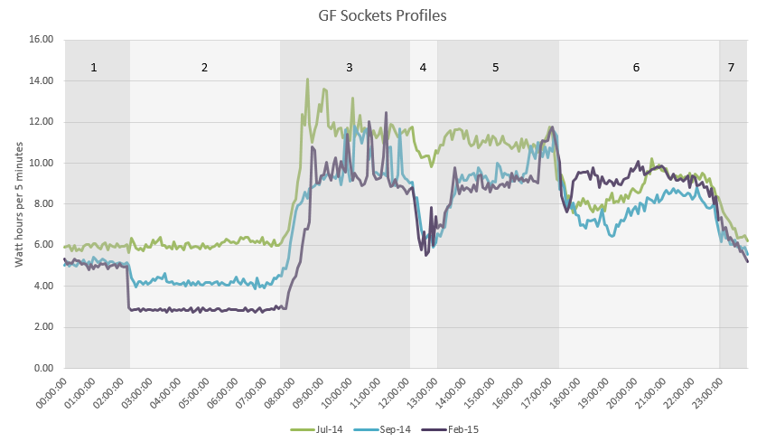
Bands 1 to 7: 1, 2 and 7 are overnight, 3 and 5 are working hours, 4 is lunch break, and 6 is evening.

The green line represents July 2014. This is the baseline: using IT and TV equipment without any specific intervention to reduce energy. In August I plugged in a time switch to switch the Virgin V+ box off between 0200hrs and 1600hrs (we never watch or have anything set to record during these times). The benefit of doing so is shown in the September 2014 profile (blue) in band 2. Also in August, several local drives were replaced with two main server drives – the difference in power use in bands 3 and 5 shows that the new equipment is less power hungry (≅80 kWh/yr saving).

In January 2015, the Philips TV was added to the timer circuit, and the timer adjusted slightly (0200 to 1700 hrs). This is shown by the purple line for February 2015. Now the TV and Virgin V+ box both switch off for 15 hours in every 24, and this translates to 140 kWh/yr for the V+ box and a further 100 kWh for the TV: a total of 240 kWh/yr, around £35. The £5 timer has paid for itself in less than two months! Why does the TV equipment use so much in standby? Hopefully, the new EU Ecodesign Directive will have sorted this out for future replacement equipment.

The chart shows our current baseload (band 2) as 34 Wh (2.8 Wh/5mins), or 0.8 kWh/day (300 kWh/yr). This is due to the broadband router (which can’t be time clock controlled) and server equipment in standby/eco mode. At £45/year, we may need to accept that this is as good as it gets. May be Virgin will bring out more energy efficient equipment in the future (V+ box and broadband superhub): if not we may need to consider alternatives.

Overall, whether due to specific interventions, or down to incidental benefit of replacing equipment, the energy savings from this one circuit is forecast to be around 320 kWh/year, approximately £48 – a 10% reduction on our total electricity use.

electrical energy use

The sub-meters that were installed (see earlier post) have been sending data every 5 minutes to the data logger for the last 18 months. Regular analysis of this energy data has allowed us to start optimising our energy use. The chart below shows the recorded energy use for each electrical circuit (click for enlargement).

Annual Electrical Profiles

The green coloured stacks show the lower ground floor socket circuit, and purple is for the ground floor sockets. These two circuits were responsible for over half our annual electrical use (2014). Given that we operate two separate businesses from home, the ground floor circuit (mostly IT and electronics) did not ring too many alarm bells at first. However, there is room for some efficiency here – additional plug-in meters for individual equipment have been fitted, and results from this investigation will be posted shortly. A closer look at the lower ground floor showed that a fridge freezer (which we inherited with the house) was responsible for nearly 60% of the consumption of that circuit (15% of total electricity). We made a decision in October 2014 to retire the old fridge and replaced it with a new efficient A+ model. Whilst it has made a significant improvement, in hindsight, we should have gone for an A+++ model. Although an extra £150 to buy, the payback from additional energy saved would have been a similar 7-8 years as with the A+ model. But then A+++ model availability is fairly limited right now, and A++ unit payback (similar purchase price to A+++ but greater model choices) wasn’t worth it in payback terms (9-10 years).

The blue colour on the chart shows the lighting energy use, which varies as expected across the seasons. However, November 2013 to February 2014 showed a higher than expected energy use for lighting, so some changes were made:  changing over a couple of regular-use lamps to LEDs, and being more economical with use. The reduction in energy use 12 months on (November 2014 to February 2015) is fairly evident – approximately half the amount of energy used. Except for the MVHR circuit, the remaining circuits are limited in their ability to be further optimised. The MVHR unit used a total of 290 kWh in 2014, which is within expectations. It has just been re-commissioned, which resulted in some fan speed adjustments to slightly lower settings, but this summer we may also look to switch it off for some periods when windows are open.

The dotted blue line shows the total electrical energy use trend over this period. We are on a downward trajectory, which is good. Our total electricity for 2014 was 3240 kWh – a 21% reduction compared to pre-retrofit use of 4120 kWh (nearer to the UK average household for 2013 of 4170 kWh¹). The aim is to get the annual consumption comfortably below 3000 kWh – a  further 10-20%, which looks to be achievable.

¹ Energy Consumption in the UK (2014) – Department of Energy & Climate Change

post retrofit energy data: the first year

Total Energy Use_1

The chart shows a summary of our measured energy use over the last 12 months for gas and electricity, compared to energy the first (base) year that we were here, which spanned a cold winter (2010_11). Over this period we used a huge amount of gas: 24,367 kWh (typical consumption for an older home is 20,500 kWh/annum¹). The split between heating and hot water was estimated² as 89% and 11% of total gas use respectively, and equates to a specific heating consumption of 140.3 kWh/m²/yr. The comfort in the house was poor that winter and the old heating system really struggled to keep the house warm.

Now fast forward to the last winter 2013_14³, which was comparatively mild, but the reduction in space heating and total gas use is quite striking. Total gas use has reduced by almost 80% compared to the base year, and space heating has reduced by almost 90%. Total gas consumption was 5300 kWh for the year, with proportions being 47% for space heating, 47% for hot water and 6% for new gas hob. The specific heating energy for the last year was 13.1 kWh/m²/yr, which comes in a touch below the Passivhaus target of 15 kWh/m²/yr.

Weekly Degree days

The chart above shows the weekly gas meter readings (total gas) with the degree days overlaid (blue line). Put simply, heating degree days give an estimate of the amount of heating energy, calculated using local, historic weather data. The chart shows a very close fit between the degree days and heating energy use for the first winter (left side of chart). Moving toward the right shows how the gas has progressively reduced (note yellow areas denote when gas was decommissioned during construction: meter reading substituted for electrical heater meter readings). Most striking is the comparison between the last winter of 2013_14 to the winter of 2010_11.

In acknowledgement that it was an unusually mild winter, I have carried out a degree day assessment to determine the amount of heating that would have been required in a cold winter (using the long, cold winter of 2012_13 for the assessment comparison). The results of the assessment for this region, estimate that 21% more heating energy would have been required. This would increase our specific heat demand by 2.7 kWh/m²/yr, to 15.8 kWh/m²/yr – refer back to the right-hand column on the top chart ‘2013_14 DD adjusted’. This revised value is a little above the maximum for a Passivhaus, but is much lower that the maximum allowed for a Passivhaus retrofit (EnerPHit), which is 25 kWh/m²/yr.

There is still a little more thermal work to do beneath the house (insulation and airtightness), so hopefully we will continue to make reductions. But we are very pleased with the results so far. Or, as one of our neighbour’s put it: ‘snug and smug’!

Electrical energy has reduced by 17% compared to the first year, although we still have some further efficiencies to make. All lighting is now either LED (approx 50%), or a mix of compact and linear fluorescent, which is the main measure so far. But, we added an MVHR ventilation system as part of the retrofit, so a 17% overall reduction is not too bad right now.

More details will become available shortly, particularly for electrical energy use, which is fully sub-metered. At some point I hope to be able to do some in-depth analysis on the gas use to measure, rather than estimate, the proportions for heating, hot water and cooking. But, with an annual gas bill of C.£200, it is difficult to justify spending the best part of £1000 to buy and fit the monitoring kit and pulsed meters to do this.

References:
1. Source OFGEM: Typical Domestic Energy Figures.
2. Estimate based upon average of weekly summer gas readings multiplied by total weeks/year.
3. Analysis for years 2012_13 has not been included in chart due to  construction activities.